display属性
本文将尽可能详细的讲述display属性,下面是示例公用代码
#公共代码

<view class="father">
    <view class="son">1</view>
    <view class="son">2</view>
    <view class="son">3</view>
    <view class="son">4</view>
    <view class="son">5</view>
    <view class="son">6</view>
    <view class="son">7</view>
</view>
display:block;
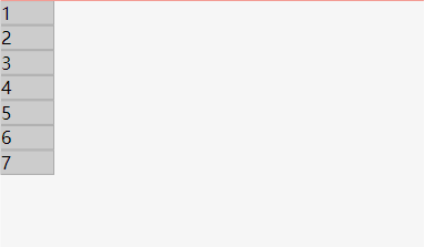
描述:块级元素,独占一行,宽度默认为父元素的 100%
常见元素:<div>, <p>, <h1> 至 <h6>, <ul>, <ol>, <li> 等
.father{
.son{
display: block;
width: 50px;
background-color: #ccc;
border: 1px solid #aaa;
}
}
display:inline;
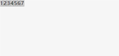
描述:行内元素,不独占一行,宽度仅为其内容的宽度
常见元素:<span>, <a>, <strong>, <em>, <img> 等
.father{
.son{
display: inline;
width: 50px;
background-color: #ccc;
border: 1px solid #aaa;
}
}
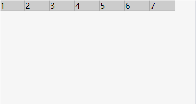
display:inline-block;
描述:行内块级元素,不独占一行,但可以设置宽度和高度.father{
.son{
display: inline-block;
width: 50px;
background-color: #ccc;
border: 1px solid #aaa;
}
}
display:none;
描述:元素不会被显示.father{
.son{
display: none;
width: 50px;
background-color: #ccc;
border: 1px solid #aaa;
}
}
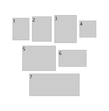
display:flex;
描述:弹性布局,用于创建灵活的布局容器(父级叫容器,子级叫项目)。====================================================
###############以下6个属性是写在容器内的#############
====================================================
###flex-direction属性决定主轴的方向(即项目的排列方向)
flex-direction: row; #默认值,主轴为水平方向,起点在左端。
flex-direction: row-reverse; #主轴为水平方向,起点在右端。
flex-direction: column; #主轴为垂直方向,起点在上沿。
flex-direction: column-reverse; #主轴为垂直方向,起点在下沿。
====================================================
###flex-wrap属性定义,如果一条轴线排不下,如何换行
flex-wrap: nowrap; #默认值,不换行
flex-wrap: wrap; #换行,第一行在上面
flex-wrap: wrap-reverse; #换行,第一行在下面
====================================================
###flex-flow属性是flex-direction属性和flex-wrap属性的简写形式,默认值为row nowrap
flex-flow: row nowrap;
====================================================
###justify-content属性定义了项目在主轴上的对齐方式
justify-content: flex-start; #默认值,左对齐
justify-content: flex-end; #右对齐
justify-content: center; #居中
justify-content: space-between; #两端对齐,项目之间的间隔都相等
justify-content: space-around; #每个项目两侧的间隔相等。所以,项目之间的间隔比项目与边框的间隔大一倍
====================================================
###align-items属性定义项目在交叉轴上如何对齐。
align-items: flex-start; #交叉轴的起点对齐
align-items: flex-end; #交叉轴的终点对齐
align-items: center; #交叉轴的中点对齐
align-items: baseline; #项目的第一行文字的基线对齐
align-items: stretch; #默认值,如果项目未设置高度或设为auto,将占满整个容器的高度
====================================================
###align-content属性定义了多根轴线的对齐方式。如果项目只有一根轴线,该属性不起作用
align-content: flex-start; #与交叉轴的起点对齐。
align-content: flex-end; #与交叉轴的终点对齐
align-content: center; #与交叉轴的中点对齐。
align-content: space-between; #与交叉轴两端对齐,轴线之间的间隔平均分布。
align-content: space-around; #每根轴线两侧的间隔都相等。所以,轴线之间的间隔比轴线与边框的间隔大一倍
align-content: stretch; #默认值,轴线占满整个交叉轴。
===================================================
###########以下6个属性是写在项目里的############
===================================================
###order属性定义项目的排列顺序。数值越小,排列越靠前,默认为0
order: 0;
==================================================
###flex-grow属性定义项目的放大比例,默认为0,即如果存在剩余空间,也不放大。
###如果所有项目的flex-grow属性都为1,则它们将等分剩余空间(如果有的话)。如果一个项目的flex-grow属性为2,其他项目都为1,则前者占据的剩余空间将比其他项多一倍。
flex-grow: 0;
==================================================
###flex-shrink属性定义了项目的缩小比例,默认为1,即如果空间不足,该项目将缩小。
###如果所有项目的flex-shrink属性都为1,当空间不足时,都将等比例缩小。如果一个项目的flex-shrink属性为0,其他项目都为1,则空间不足时,前者不缩小。
###负值对该属性无效。
flex-shrink: 1;
==================================================
###flex-basis属性定义了在分配多余空间之前,项目占据的主轴空间(main size)。浏览器根据这个属性,计算主轴是否有多余空间。它的默认值为auto,即项目的本来大小。
flex-basis: auto;
==================================================
###flex属性是flex-grow, flex-shrink 和 flex-basis的简写,默认值为0 1 auto。后两个属性可选。
###该属性有两个快捷值:auto (1 1 auto) 和 none (0 0 auto)。
###建议优先使用这个属性,而不是单独写三个分离的属性,因为浏览器会推算相关值。
flex: none
==================================================
###align-self属性允许单个项目有与其他项目不一样的对齐方式,可覆盖align-items属性。默认值为auto,表示继承父元素的align-items属性,如果没有父元素,则等同于stretch。
###该属性可能取6个值,除了auto,其他都与align-items属性完全一致。
align-self: auto | flex-start | flex-end | center | baseline | stretch;
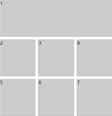
==================================================#这里只列举一个例子
.father{
height: 400px;
background-color: white;
display: flex;
flex-direction: row;
flex-wrap: wrap;
justify-content: center;
align-items: center;
align-content: center;
gap: 10px;
.son{
background-color: #ccc;
border: 1px solid #aaa;
&:nth-child(1){
width: 60px;
height: 80px;
}
&:nth-child(2){
width: 70px;
height: 90px;
}
&:nth-child(3){
width: 80px;
height: 100px;
}
&:nth-child(4){
width: 60px;
height: 60px;
}
&:nth-child(5){
width: 120px;
height: 90px;
}
&:nth-child(6){
width: 100px;
height: 60px;
}
&:nth-child(7){
width: 180px;
height: 80px;
}
}
}
display:grid;
描述:网格布局,用于创建二维布局(父级叫容器,子级叫网格元素)====================================================
###############以下5个属性是写在容器内的#############
====================================================
###grid-template-columns 属性定义了网格布局中的列的数量,它也可以设置每个列的宽度。
###如果您在 4 列网格中有 4 个以上的网格元素,网格布局会生成新的一行放置该元素。
###定义四列,每列宽度一致
grid-template-columns: auto auto auto auto;
###定义四列,其中三列宽度指定
grid-template-columns: 80px 200px auto 40px;
###分数单位 (fr)
###一个fr单位代表网格容器中可用空间的一等份,该属性定义了一个网格定义将创建三个相等宽度的轨道,这些轨道会随着可用空间增长和收缩。
grid-template-columns: 1fr 2fr 1fr;
###自动适应 (auto 和 minmax)
###auto表示列宽根据内容自动调整。minmax(min, max)表示列宽在最小值和最大值之间自动调整。
grid-template-columns: auto 1fr minmax(100px, 200px);
###重复 (repeat)
###repeat(n, track-size)表示重复定义多列,其中 n 是重复次数,track-size 是列宽
grid-template-columns: repeat(3, 100px);
###自动填充 (auto-fill 和 auto-fit)
###auto-fill:根据可用空间尽可能多地填充列。auto-fit:根据可用空间填充列,并且会调整列的大小以填满整个容器。
grid-template-columns: repeat(auto-fill, minmax(100px, 1fr));
====================================================
###grid-template-rows属性定义了网格布局中的行的数量,它也可以设置每行的宽度。
###grid-template-rows用法和grid-template-columns一样,就不详细解释了。
###定义了两行,第一行高度80px,第二行高度200px。
grid-template-rows: 80px 200px;
grid-template-rows: 1fr 2fr 1fr;
grid-template-rows: auto 1fr minmax(100px, 200px);
grid-template-rows: repeat(3, 100px);
grid-template-rows: repeat(auto-fill, minmax(100px, 1fr));
====================================================
###grid-column-gap属性来设置列之间的网格间距
grid-column-gap: 20px;
###grid-row-gap属性来设置行之间的网格间距
grid-row-gap: 20px;
###grid-gap属性是grid-row-gap和the grid-column-gap属性的简写
###grid-gap属性可以同时设置行间距和列间距
grid-gap: 20px 30px;
grid-gap: 20px;
gap: 20px;
====================================================
###justify-content属性用于对齐容器内的网格,设置如何分配顺着弹性容器主轴(或者网格行轴) 的元素之间及其周围的空间。
###网格的总宽度必须小于容器的宽度才能使 justify-content 属性生效。
justify-content: start; #默认值,左对齐
justify-content: end; #右对齐
justify-content: center; #居中
justify-content: space-between; #均匀排列每个元素,首个元素放置于起点,末尾元素放置于终点
justify-content: space-evenly; #用于均匀排列每个元素,每个元素之间的间隔相等
justify-content: space-around; #均匀排列每个元素,每个元素周围分配相同的空间
====================================================
###align-content属性用于设置垂直方向上的网格元素在容器中的对齐方式。
###网格元素的总高度必须小于容器的高度才能使 align-content 属性生效
align-content: start; #设置在容器开始处开始排列
align-content: end; #设置在容器末尾处开始排列
align-content: center; #设置容器中所有行居中对齐
align-content: space-between; #用于均匀排列每一行,第一行放置于开始处,最后一行放置于末尾
align-content: space-evenly; #设置容器中每一行间隔相等
align-content: space-around; #设置容器中每一行分配相同的空间
===================================================
###########以下3个属性是写在网格元素里的############
===================================================
###grid-column属性定义了网格元素列的开始和结束位置,类似表格的合并选项。
###grid-column是grid-column-start和grid-column-end属性的简写属性
###可以参考行号来设置网格元素,也可以使用关键字 "span" 来定义元素将跨越的列数
###在第一列开始,在第三列前结束,合并了两列
grid-column: 1 / 3;
###在第一列开始,合并了三列
grid-column: 1 / span 3;
###在第二列开始,合并了三列
grid-column: 2 / span 3;
==================================================
###grid-row属性定义了网格元素行的开始和结束位置。
###grid-row是grid-row-start和grid-row-end属性的简写属性。
###第一行开始,第四行前结束,合并了三行
grid-row: 1 / 4;
###第一行开始,合并了两行
grid-row: 1 / span 2;
==================================================
###grid-area属性是grid-row-start,grid-column-start,grid-row-end以及grid-column-end属性的简写
###grid-area属性可以对网格元素进行命名,命名的网格元素可以通过容器的 grid-template-areas属性来引用。
###第1行开始和第2列开始,第5行和第6列结束
grid-area: 1 / 2 / 5 / 6;
###第2行开始和第1列开始,横跨2行3列
grid-area: 2 / 1 / span 2 / span 3;#这里列举几个例子###示例一
.father{
height: 400px;
background-color: white;
display: grid;
grid-template-columns: 1fr 1fr 1fr;
grid-template-rows: auto auto auto;
grid-gap: 10px;
.son{
background-color: #ccc;
border: 1px solid #aaa;
&:nth-child(1){
grid-column: 1 / 4;
}
}
}
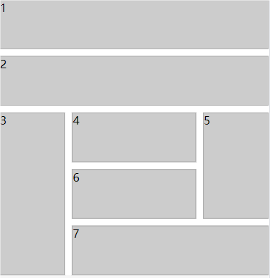
###示例二

.father{
    height: 400px;
    background-color: white;
    display: grid;
    grid-template-areas:
        'header header header header'
        'banner banner banner banner'
        'left top top right'
        'left bottom bottom right'
        'left footer footer footer';
    grid-gap: 10px;
    .son{
        background-color: #ccc;
        border: 1px solid #aaa;
        &:nth-child(1){
            grid-area: header;
        }
        &:nth-child(2){
            grid-area: banner;
        }
        &:nth-child(3){
            grid-area: left;
        }
        &:nth-child(4){
            grid-area: top;
        }
        &:nth-child(5){
            grid-area: right;
        }
        &:nth-child(6){
            grid-area: bottom;
        }
        &:nth-child(7){
            grid-area: footer;
        }
    }
}