HTML垂直居中
示例如下:
<div class="aaa">
    <div class="bbb">
    </div>
</div>
方法一:借助伪元素
<style>
    .aaa{
        width: 200px;
        height: 100px;
        background: aquamarine;
        text-align: center;
    }
    .aaa::after{
        display: inline-block;
        width: 0;
        height: 100%;
        content: "";
        vertical-align: middle;
    }
    .bbb{
        width: 100px;
        height: 50px;
        background: antiquewhite;
        display:inline-block;
        vertical-align:middle;
    }
</style>
注意:::after 和:after效果相同,原因如下:
在 CSS3 中,双冒号取代了伪元素的单冒号表示法,这是 W3C 为了区分伪类和伪元素。
在 CSS2 和 CSS1 中,伪类和伪元素都使用了单冒号语法。
为了向后兼容,CSS2 和 CSS1 伪元素可接受单冒号语法。
建议规范书写,使用::after
方法二:借助transform
<style>
    .aaa{
        width: 200px;
        height: 100px;
        background: aquamarine;
        position: relative;
    }
    .bbb{
        width: 100px;
        height: 50px;
        background:antiquewhite;
        position:absolute;
        left:50%;
        top:50%;
        transform: translate(-50%,-50%);
    }
</style>
方法三:借助margin
<style>
    .aaa{
        width: 200px;
        height: 100px;
        background: aquamarine;
        position: relative;
    }
    .bbb{
        width: 100px;
        height: 50px;
        background:antiquewhite;
        position:absolute;
        left:0;
        right:0;
        top:0;
        bottom:0;
        margin: auto;
    }
</style>
方法四:借助position
<style>
    .aaa{
        width: 200px;
        height: 100px;
        background: aquamarine;
        position: relative;
    }
    .bbb{
        width: 100px;
        height: 50px;
        background:antiquewhite;
        position:absolute;
        left:50%;
        top:50%;
        margin-top: -25px;
        margin-left: -50px;
    }
</style>
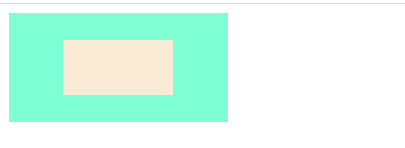
以上四种方法,都能达到垂直居中的效果,效果如下: