CSS借助@media使得页面自适应
先看代码:
<div class="aaa"></div>
<style>
    .aaa{
        width: 100%;
        height: 100px;
        background: blue;
    }

    @media screen and (max-width: 1000px) {
        .aaa{
            height: 200px;
            background: green;
        }
    }

    @media screen and (max-width: 700px) {
        .aaa{
            width: 400px;
            background: red;
        }
    }

</style>
当页面宽度大于1000px时,效果如下:

当页面宽度大于700px小于等于1000px时,效果如下:

当页面宽度小于等于700px时,效果如下:

从上述例子可以看出,@media screen and (max-width: 700px)不仅改变了aaa原本的颜色和宽度,还继承了@media screen and (max-width: 1000px)内的高度
再看一个例子
<div class="bbb"></div>
<style>
    .bbb{
        width: 100%;
        height: 100px;
        background: yellow;
    }

    @media only screen and (width: 1000px) {
        .bbb{
            height: 200px;
            background: red;
        }
    }

    @media not screen and (min-width: 700px) {
        .bbb{
            width: 400px;
            background: green;
        }
    }

</style>
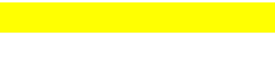
当页面宽度大于1000px时,效果如下
当页面宽度等于1000px时,效果如下

当页面宽度小于1000px大于等于700px时,效果如下

当页面宽度小于700px时,效果如下

可以看出:
@media only screen and(width: 1000px)只有在满足width=1000px的要求时,样式才会发生改变。
而@media not screen and(min-width: 700px)的满足条件和@media screen and (max-width: 700px)是近乎相似的,两者之间只相差个等于,前者在页面宽度小于700px时样式才会改变,而后者在页面宽度等于小于700px时样式就发生了改变。
除上述例子外,@media还有以下几种写法,可以结合上述例子灵活运用
/* screen用于定义电脑屏幕,平板电脑,智能手机等设备上的CSS样式 */
@media screen and () {
   /* css样式  */
}

/* print用于定义打印机设备上显示的CSS样式 */
@media print and () {
   /* css样式  */
}

/* speech用于定义屏幕阅读器设备上显示的CSS样式 */
@media speech and () {
   /* css样式  */
}

/* all用于定义以上所有设备上显示的CSS样式 */
@media all and () {
   /* css样式  */
}